General Thoughts

Dinosaur Educates!?

Check out this video of an amazing idea for surprising guests at educational facilities (warning:  adult language in the comments section...it really freaked some folks out!). This "live" dinosaur walks amongst the shocked visitors at the Natural History Museum of Los Angeles County, and could be considered an interesting version of an animal presentation at zoos! I'm always curious about how to make presentations and shows (not to mention videos) more intriguing, and less "showlike" -- walking into a theater to await a formal presentation just seems so anti-nature to me.  However, this isnt that far from what we do currently, with the most elaborate of edutainment (like at SeaWorld) with amazing costumes, scenery and sound.  This is actually much more simple--a person in a costume--albeit an immensely impressive costume.  But, its just a person in a costume, nonetheless.

Is this the real deal in edutainment?  Does this inspire or intrigue, or just startle and scare the little ones (and adults, alike!)?  Would it be as impressive if it were a different animal?  Could it serve as a presentation in and of itself, or simply as another tool in our kit?  Let me know what you think!

Add to FacebookAdd to DiggAdd to Del.icio.usAdd to StumbleuponAdd to RedditAdd to BlinklistAdd to Ma.gnoliaAdd to TechnoratiAdd to FurlAdd to Newsvine

The Next Zoo Design Revolution?

Landscape immersion, which is a type of design intended to "immerse" the visitor in the same natural habitat as the animal, effectively began with the Woodland Park Zoo's gorilla exhibit.  Created by zoo design godfathers Grant Jones and Jon Coe as a collaboration with Woodland Park then-director David Hancocks and biologist Dennis Paulson, they coined the term landscape immersion, and thus began the philosophical shift from a homocentric view of zoos to a biocentric view.  We now spend massive amounts of resources re-creating "natural" places and cultural phenomena, in an effort to connect people to the earth; to inspire respect of natural places.  Back in 1978, this style of design was fresh, new, innovative, revolutionary; nearly thirty years later, the style has become so a part of zoo culture that any exhibit not designed in this manner is questioned for its validity and chances of success.  However, should landscape immersion continue to be our design standard?  How do we push to the next step beyond landscape immersion?

True and successful landscape immersion requires designers to experience a habitat first-hand before beginning to design a re-creation of it.  They research the essence of the habitat, the ecosystem structure within the habitat, and the natural ebbs and flows the habitat would undergo.  The animal is an integral part of the ecosystem, not just the centerpiece of a painted scene.  The visitor is whisked away to another world, drastically different from the asphalt sidewalks and ice cream shops of the zoo midway.  Today's landscape immersion is, too often, not this.  Today's landscape immersion usually means planting the visitor space with the same plants as seen in the animal exhibit, and using props from a culture as shade structures, means to hide back-of-house buildings, and educational interpretives.  Moreover, today's visitor to a modern zoo no longer has their breath taken away by a landscape immersion exhibit; they simply expect to be immersed in an animal's habitat. The magic of landscape immersion is gone.  Along with that, the opportunity to educate and inspire is waning, because, as Coe has said himself, "Only the emotional side, in the end, has the power to generate changes in behavior" (Powell, 1997).  If the "oh my" moment is gone, does education stand a chance?  

Landscape immersion does not generate longer experiences, as commonly believed.  This can easily be shown true by simply observing visitor behavior at exhibits.  After studying visitor length-of-stay time at viewing areas, little to no difference can be observed between the old, concrete moated tiger exhibit at Philadelphia Zoo and the landscape and cultural immersion tiger exhibit at Disney's Animal Kingdom.  The average maximum stay time of 90 seconds has been consistently shown through observations at other exhibits as well, including the gorilla exhibit and bongo exhibit at Cincinnati Zoo, and the polar bear exhibits at Detroit Zoo and Louisville Zoo.  Despite renovations and millions of dollars spent on landscape, rockwork, and interpretives, the most we can expect of our visitors is a minute and a half.  Is this time shorter now than at immersion exhibits in the early 1980's?  What can we do now to increase this time?  Or, what can we do to get the most impact for our minute and a half?

One of the biggest complaints against landscape immersion is the difficulty, generally, in spotting and clearly seeing the animals.  Therefore, proximity to animals should be a chief concern in exhibit design.  Visitors want to experience something special.   They want to do something no one else gets to do; something they have never done.  Most importantly, in doing these things, visitors feel connected to the animals.  Creating the connection should be of the utmost concern for designers and zoos. 

Another component lacking in modern zoo design (not just landscape immersion specifically) is the integration of behavioral enrichment into the basic design process.  Too often behavioral enrichment is an aspect of the exhibit that is not addressed by zoos to the architectural designer, even if the behavioral enrichment program is being developed concurrently.  Most zoos still see the enrichment program as a separate aspect of the new exhibit to be implemented by the keepers after the exhibit is opened.  Most architectural designers are ignorant to the importance of behavioral enrichment as a means not only to increase the health and welfare of the animal, but also in creating an active exhibit with active animals, which translates into longer stay times.  Thus, enrichment generally is not addressed as an aspect of design, and ultimately we see beautiful new landscape immersion exhibits with large orange boomer balls and blue plastic barrels.  Can these be considered cultural props?  Recently, behavioral enrichment has been integrated beautifully into primate exhibits, but what about ungulates and big cats? 

Connection creation and enrichment are the two most important issues that we must address in order to move beyond landscape immersion. The complexity of stepping beyond landscape immersion may seem a daunting task.  However, the essence of the next successful step will be in creating "novelty"-something new or unexpected.  Novelty to visitors, both within every new exhibit they encounter, as well as within the same exhibit upon repeat visits.  We must create novelty to animals, both in new enrichment devices and methods, as well as within their own habitats.  We need to make adaptable habitats that can be changed on a daily, weekly, monthly or seasonal basis.  We need to make experiences for the visitor and animal that they can share, becoming intuitively novel, since every person or animal will react slightly different in new situations.  Thus, our new exhibits will stay new, increasing visitor repeat attendance, and discouraging cookie cutter exhibit design. 

But how do we begin to do this?  In addressing the issues of connection creation and incorporation of enrichment into design, the first and most critical step will be to develop stronger relationships between architectural designers and zoo staff.  Designers need to be educated by the keepers on animals' behaviors, both in the wild and in captivity, as well as on methods of behavioral enrichment.  Designers should spend a day or two working side-by-side with the keepers as "keepers for a day." This will help designers to not only understand the needs of the keepers in their daily work routines, but also to help create bonds between designers and the animals whose homes they are creating.  The zoo staff has a passion for animals that most architectural designers are lacking.  This passion needs to be shared and experienced by the designers. 

In "novelty-based" design, zoos and designers need to work together to develop new methods of enrichment and test them before integrating them into design.  Design schedules and budgets should include a phase for enrichment development and testing, wherein the designers work with the keepers to create prototypes to be tested with the animals.  If the zoo is designing exhibits for animals they currently do not have in collection, partnerships should be developed to test enrichment devices at other zoos with those animals.  These findings should be recorded scientifically and published for the entire zoo community to share.  If the zoo uses training as enrichment, the designers need to experience training sessions and clearly understand the need and utility of the training.  Keepers and designers should be discussing how all of these methods can be displayed on exhibit.

Specific enrichment goals need to be addressed at design kick-off meetings, making numerical goals for incorporating enrichment devices and creating new methods.    Enrichment must be seen as a philosophical aspect of design, incorporated into the master planning process, because if animals are active and happy, visitors will become more engaged.  Enrichment must be planned not only for the opening day of the exhibit, but for the future of the exhibit as well.  Animals become acclimated to enrichment devices and stop using them.  We must plan for this, developing phasing plans for enrichment, and flexibility of the exhibit design for novelty of the environment.  Most importantly, after the construction is complete, studies must be conducted to determine the successes and failures of enrichment techniques.  These results should be shared with the zoo community, and especially, the designers. 

Secondly, the "novelty-based" design process must become "connection-centered," not visitor-centered or animal-centered.  Connections are created both by proximity and by experience.   Landscape immersion began to explore this idea by attempting to have visitors and animals in the same habitat, thus experiencing the same things.  However, in landscape immersion, we don't experience the same things at all.  As visitors, we have a choice to move into a different area, to eat ice cream or hot dogs, to sit and watch the gorillas or to go see the penguins.  We don't swim in the same water as the polar bears and we don't get to swing around on ropes like orangutans.  What if we started creating these shared experiences?  Can we make environments for animals and visitors that are truly similar?  What if the actions of a visitor change the environment for the animal?  What if the actions of an animal change the environment for the visitor?  No longer would we be bound by the idea that the habitat must look like the animals' wild habitat.  We could make it look like any thing, any place, any time, as long as the visitor and animal are engaged and ultimately, connected.  
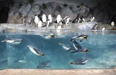
We have already seen a movement starting to push beyond landscape immersion, and, in some instances, toward "novelty-based" design.  Several new exhibits, including the St. Louis Zoo ‘Penguin & Puffin Coast' exhibit and the San Francisco Zoo's ‘Lipman Family Lemur Forest', utilize natural habitat but also incorporate distinctly non-immersive elements, and are exceedingly successful.  These exhibits focus on getting the visitor close to the animals (connection-centered) and being surrounded by active animals (behavioral understanding and enrichment incorporation).  This experience, which will be different and therefore novel upon each visit, makes these exhibits extremely emotional and therefore memorable to visitors, and begins to create a connection.  These exhibits are a step in the right direction toward "novelty-based" design.  Using this type of design, we can move to the next incremental step in the evolution of landscape immersion, keeping the "oh my!" moment, and continuing to educate and inspire our zoo visitors.

Add to FacebookAdd to DiggAdd to Del.icio.usAdd to StumbleuponAdd to RedditAdd to BlinklistAdd to Ma.gnoliaAdd to TechnoratiAdd to FurlAdd to Newsvine

A Quick Lesson in Zoo Design History

Over time, zoos' physical forms have been a direct reflection of our society's values and understanding of science. It is important to understand where we've been in order to move forward, and its is also important for visitors to the older zoos to understand why certain buildings and exhibits are the way they are (as we know, zoos usually do not have an abundance of money, and struggle to keep their physical state up with the trends). Zoos, in the form we know them now, have been in existence since the mid-18th century. Prior to this, private collections existed throughout the world as far back, it is believed, to Mesopotamian times. Romans kept animals, of course, for sport, but would display the animals in a zoo-like manner, prior to their being released to their deaths in the Coliseum. But we'll focus on the mid-19th century forward.

We can easily divide the eras in zoo design into three general categories:

  1. Zoos as Jails (mid 19th to late 19th century)

  2. Zoos as Art Galleries OR the Modernist Movement (early to mid 20th century)

  3. Zoos as Conservation and Education Facilities

Zoos as Jails

This was the Age of Enlightenment and the Romantic Age, where beauty was of the upmost value and our understanding of the natural world was blossoming into a science.  Hard science in this time was all about classification and comparison.  Linneaus and Darwin were the scientific stars.  The earliest official zoos began during this period, with the London Zoo in 1828 and Philadelphia Zoo in 1874.  The early zoos were based on the mission of science for science's sake, but also were places for socializing.

As such, a balance between beauty and classification was struck.  The zoos of this time were laid out by taxonomic families, and the term "House" came into being, as in Cat House, Bird House, etc.  The architectural style was over the top beautiful.  Highly ornate bird cages and buildings themed in the most dramatic fashion were everywhere.  But, cages were small, animals were short lived, and people enjoyed the animals as beautiful objects rather than living beings.

Zoos as Art Galleries OR the Modernist Movement

During this time, the world was experiencing several wars.  The study of nature became much less important, but Romanticism still existed.  Science progressed into problem solving, and medical advances were abundant.  Vaccinations became prevalent and the idea of killing germs to increase health and extend life expectancy came into being.

During this time, zoos held a similar value as art galleries, and the exhibits became mini-paintings and sculptures.  In the Romantic movement, a proper landscape exists with a foreground, mid-ground, and background.  Carl Hagenbeck became the first-ever to apply this theory to zoo design resulting in the birth of the barless (or 'moated') exhibit.  His motivation was more about creating a living Romantic landscape, like the famous painters of his time, than to recreate nature for moral sensitivities.  This style started to  catch on in zoos, but generally became popular much later.

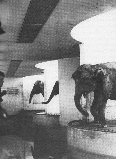
At the same time, the modernist movement was catching fire.  Modernism requires that form follow function.  This belief along with the advances in medicine and desire for sterilization, created zoo exhibits that were easily hosed down and cleaned regularly.  This meant concrete everywhere.  Additionally, the Modernist Art scene infiltrated zoo design, and the hard, simple lines for which modernist style is famous, reigned supreme.  The result was exhibits that look more like sculpture than habitat.

With both the Romanticism and Modernist styles abounding in this time period, zoo design was more about creating an art gallery than a responsible home for animals.  Interestingly, due to the increased attention to health, captive animals' life expectancies did increase almost to today's levels.  The only thing missing was attention to the animals' mental health.

Zoos as Conservation and Education Facilities

Since the mid-20th century, our society has developed a strong sense of environmental awareness and human rights ethics, which eventually gave way to animal rights as well.  In 1950, Hediger wrote "Wild Animals in Captivity" which opened people's eyes to the idea of husbandry practices and exhibit design based on an animal's natural history.  What a novel approach!  With the advances in healthcare (which overlaps into this era), animals in captivity began to be treated for physical as well as mental health.

During the 1970s, a group of folks at the Woodland Park Zoo (including two young designers from Jones and Jones Architects) decided to resurrect Hagenbeck's ideas from long ago--and to advance them.

Instead of creating a living painting, they wanted to put the visitor into the habitat...Immerse them in the painting.  And, instead of creating a visually exciting statement only, they decided to re-create the habitat in the which the animal was naturally seen.  All of these things were incorporated into the gorilla exhibit at Woodland Park Zoo, and, thus, landscape immersion was born.

Since then, the idea of landscape immersion has caught on like wildfire, and today, is the standard of responsible zoo design.  Understanding the past, I have to wonder where we are headed next...A topic for future discussion.

gsa200m05.png
Add to Facebook

Add to Facebook

Add to Digg

Add to Digg

Add to Del.icio.us

Add to Del.icio.us

Add to Stumbleupon

Add to Stumbleupon

Add to Reddit

Add to Reddit

Add to Blinklist

Add to Blinklist

Add to Ma.gnolia

Add to Ma.gnolia

Add to Technorati

Add to Technorati

Add to Furl

Add to Furl

Add to Newsvine

Add to Newsvine

gsa211m05.png

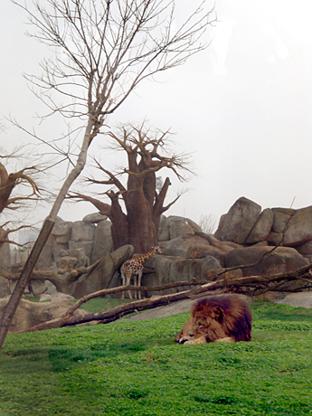
BioParc Valencia Opens

I have to admit that I'm a little behind on this one, but the new zoo in Valencia, Spain, called the BioParc, is now open. In fact, it opened early this spring, but thanks to an "also behind the times" mention in American Airlines' inflight magazine, I'm bringing it to you now.

Apparently, only phase one has been opened. This phase is focused entirely on Africa. Subsequent phases will include Southeast Asia and the Tropics (which, to me is one in the same, so I'm confused!). The park prides itself on the use of landscape immersion techniques, blurring the line of the animals' boundaries. One guest describes his experience eloquently here, including what sounds to be a pretty incredible walk-amongst-the-lemurs exhibit.

The park is approximately 25 acres (not sure if that is the final size or what is currently open), ticket price is 20 euros, and the collection is over 4000 animals strong. The ZooBeat forum outlines the current species on hand.

Unfortunately, the official website is in Espanol, and I know only a few words unlikely to be found on the site. Perhaps someone could help me out with some translation?

Add to FacebookAdd to DiggAdd to Del.icio.usAdd to StumbleuponAdd to RedditAdd to BlinklistAdd to Ma.gnoliaAdd to TechnoratiAdd to FurlAdd to Newsvine

The Future of Science Based Institutions

The question of co-evolution amongst zoos, aquaria, and science museums has been a lingering muse for decades now.  Back in 1986, Jon Coe cleverly equated the historical relationships to convergent evolution, and through his paper, which was more history lesson than predictor of the future, compared their similarities through time.  Ultimately, he suggests "an awareness of others and ourselves, together with a willingness to communicate, can lead us further into an exciting co-evolution of zoo, aquariums and natural history museums." I'd like to take it a step further.

I often wonder why we separate all of our science institutions, dividing the natural world into equal, but succinct pieces: land animal (zoos), plant (botanical gardens), aquatic animal (aquaria), and the sciences (natural history museums and science centers).  Of course, overlap occurs; zoos have fish and aquatic mammals, botanical gardens have butterfly houses, science museums have dioramas of the natural history of living creatures.  Additionally, the method of teaching the general sciences varies greatly from conservative natural history museum approaches to more "fun" and interactive science centers.

As Coe mentioned, the teaming up of these institutions would be a powerful force.  However, if, going beyond what Coe suggested, we created one institution that presented all of these disciplines, we'd be teaching holistically, presenting a unified view of the natural world that so many children and adults rarely get the chance to see.

The world has changed dramatically since the inception of these learning institutions.  Most zoos and natural history museums began at the turn of the 19th century, when for the good majority of people, we still lived in a mostly untouched rurality.  These people grew up with nature, lived in nature, or could easily visit nature, and learning about the natural world was most easily understood by the breaking down of components.

Today, however, most people live in cities or suburbs.  Any nature we experience regularly is man-made or man-influenced, and certainly does not contain a wide variety of species or habitats.  Learning about nature now becomes easier through an immersive, holistic approach.  Add in society's constant bombardment with story driven entertainment and eye-candy, and learning almost requires the same treatment.  Or so I postulate.

The Museum of Life and Science in Durham, North Carolina has already come to the same conclusion.  Currently, they house live animals, present botanical displays, a natural wetland trail, and incorporate hands-on science center activities throughout.  This is not enough for them, however.

We envision a one-of-a-kind place, a science park, offering extraordinary experiences indoors, outdoors, and virtual where children and adults learn through the pursuit of their own interests and curiosity. We will be recognized as the leader in public engagement with science in the Triangle region and as a model for science museums across the nation.

Will this be the future of science institutions?  A one-stop shop, so to speak, for education and entertainment about the natural world?  All things are intertwined; nature is a web of life.  Why not present it that way?

Read the follow-up to this post: 'MULTI-DISCIPLINARY INTEGRATION...A MOUTHFUL OF FUN.'

Add to FacebookAdd to DiggAdd to Del.icio.usAdd to StumbleuponAdd to RedditAdd to BlinklistAdd to Ma.gnoliaAdd to TechnoratiAdd to FurlAdd to Newsvine

Goodbye Elephants, Dallas Zoo Says

Dallas Zoo has become another in a long line of zoos ditching their elephant exhibits under the increasing pressure of animal activists. Their single female elephant, Jenny, will be going to the Africam Safari Park in Mexico. This decision has come after the second elephant living at the zoo, KeKe, passed away in May, leaving Jenny all alone. The AZA's standards suggest at least three females should be housed together.

The Zoo has announced plans for the defunct exhibit. They plan to expand their giraffe yard, and add more individuals, opening Spring 2009.  Additional comments from the zoo elude to plans of bringing elephants back in the future, when the zoo can afford to build a more responsible home for them.

Activists oppose the move to the Safari Park, preferring a Tennessee sanctuary to an international park where U.S. standards of care do not have to be followed. The Zoo has inspected the facility, however, and feels the Safari Park is an excellent choice.

Add to FacebookAdd to DiggAdd to Del.icio.usAdd to StumbleuponAdd to RedditAdd to BlinklistAdd to Ma.gnoliaAdd to TechnoratiAdd to FurlAdd to Newsvine

Unethical? Thailand's Tiger Temple

Thailand is touting a tiger temple where visitors can, once daily, walk amongst, pet, and be photographed with endangered animals, including tigers. The temple claims the tigers are tame, and are all the offspring from an orphaned group rescued years ago.

I won't deny the power of walking amongst these amazingly beautiful and powerful creatures, but where do we draw the line? Is petting a potentially dangerous animal truly beneficial to anyone beside the accountant at the temple?

And what of tameness via feeding the cats only cooked meat? Can this truly tame a big cat? I believe these cats can never truly be tamed, and I'm hesitant for anyone to work barrier free with the animals, not to mention letting uneducated visitors interact with them at will.

Plus, check out the photos. The cats look drugged, and definitely are chained up. Its a shame. And they call themselves a sanctuary.

What do you think?

Add to FacebookAdd to DiggAdd to Del.icio.usAdd to StumbleuponAdd to RedditAdd to BlinklistAdd to Ma.gnoliaAdd to TechnoratiAdd to FurlAdd to Newsvine

Creating Happy Places...

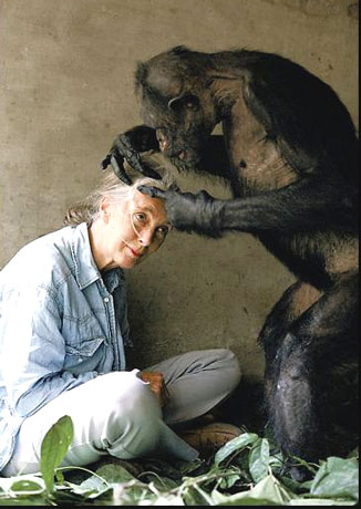
Sometimes we forget why we do what we do.  An article about Jane Goodall's new primate exhibit in Scotland reminded me.  In response to outcry against primates in captivity (notably by singer Morissey), she states:   "In an ideal world chimpanzees and monkeys would be out in the wild as they were intended to be. But in the real world, there are not so many places like that and they are getting smaller all the time.

The choice is between living in wonderful facilities like these where they are probably better off or living the wild in an area like Budongo, where one in six gets caught in a wire snare, and countries like Congo, where chimpanzees, monkeys and gorillas are shot for food commercially. If I were a chimpanzee, I know what I would choose."

Powerful words that reminds me that we're not just creating memories for parents and children, but also providing a safe, enjoyable home for many of the world's displaced creatures. 

And speaking of those memories, one San Diego Zoo visitor editorialized his recent experience at the Zoo, reminding us that, yes, zoos are about conservation and preservation, but sometimes we focus a bit too much on this aspect.

What does this mean to designers?  I think it means we need to focus on a celebration of the critters who live in the homes we build. 

Sometimes this means working with education departments to convince them that heavy messages aren't always the answer.  Sometimes this means bringing entertainment into an exhibit.  Sometimes this means making architecture less of a focus.  Sometimes this means just making an exhibit about pure fun. 

I hate to beat a dead horse (and, really, who does love doing that?), our job is to make animals interesting and alluring.  Our guests need to walk away feeling empathy, feeling connection.  Yes, facts are great, and knowledge is power.  Call me jaded, but I'll be happy if one of those kids (or, hey, even better, one of those adults) walks out of an exhibit saying, Man, those guys are cool!

Add to FacebookAdd to DiggAdd to Del.icio.usAdd to StumbleuponAdd to RedditAdd to BlinklistAdd to Ma.gnoliaAdd to TechnoratiAdd to FurlAdd to Newsvine

Enrichment Based Design, Revisited

Over ten years ago, Jon Coe wrote a paper outlining the upcoming breakthroughs in exhibit design, using enrichment based (or as he says, activity-based) design. These exhibits have now been opened and are successful. However, ten years from the original date of the paper, designers still have not fully embraced the design concept. Incorporating enrichment devices into an exhibit is one thing; to fully base design on enrichment or activity, is an entirely different animal. As Coe points out, however, design is not fully the designers' decision. A new animal habitat has many stakeholders, and even if the designer supports the idea of basing design on enrichment, the entire team of administrators, keepers, curators, and Board of Directors, not to mention all members of the design team, must also agree.

In many cases, the resources (of time, money, and/or space) just aren't there. Many times, the decision comes down to making an immersive environment or making an enriching environment. Unfortunately, many folks in the industry still hold onto the idea that an immersive environment equals animal health and activity, or at least, equal visitor satisfaction. However, active animals are much more powerful than a pretty environment, and we must work on our clients to understand this.


To Safari or Night Safari...

In the past few years, a trend of opening zoos later or keeping them open longer has been spreading across the globe, especially during summertime.  Recently, I saw that San Diego Wild Animal Park is offering night safaris until 9pm, which got me to wondering why all zoos dont capitalize on this.  For one thing, allowing visitors to come at night opens your market up to young professionals who are busy working during weekdays, and uninterested in fighting the family crowd (and heat) during the weekends.  The teenage market would also, more than likely, love extended hours as teenagers are constantly looking for places to hang out, and the zoo would be a "safe" and acceptable place from their parents point of view.

Increasing your market equals increased spending and increased chance to meet educational goals.

Secondly, nighttime visitation allows people to avoid the peak heat of summer days, and will theoretically increase their stay time.  Additionally, many animals displayed in zoos are crepuscular (active during dawn and dusk) or nocturnal, and therefore, will be the most active during evening hours.  Animal activity always equates increased stay times.

An increased stay time equals increased spending and increased chance to meet educational goals.

Opponents site the extended hours actually hurt the zoo due to increased cost of staffing for extra hours.  However, some zoos in especially hot climates have actually changed their summer hours to shift toward the evening.  For example, the Al Ain Zoo in Abu Dhabi, UAE changes their summer hours to open in the afternoon and stay open past midnight, when in winter, have more traditional morning through afternoon hours.

Another zoo in Singapore, the Singapore Night Safari Park, was actually developed to only be open in the evenings.  Their novel approach has brought loads of attention from the industry and visitors worldwide, and from what I can tell, are tremendously successful.  [youtube=http://www.youtube.com/watch?v=1Fd44p0Y_Ag&hl=en]

What's your experience with nighttime summer hours?

Add to FacebookAdd to DiggAdd to Del.icio.usAdd to StumbleuponAdd to RedditAdd to BlinklistAdd to Ma.gnoliaAdd to TechnoratiAdd to FurlAdd to Newsvine

San Francisco Zoo's Tigers Back on Exhibit

Most of us are aware of the tiger escape and subsequent attack that occurred last Christmas at the San Francisco Zoo.  The attack has spurned much controversy from the public (look at the comments on the YouTube videos below), and also within the zoo community regarding the "guidelines" the AZA puts forth. [youtube=http://www.youtube.com/watch?v=kh6finppjLI&hl=en]

The most recent published guidelines recommended 16' height on moats and with 25' width, and 20' height on walls.   San Francisco's exhibit had 15' height moat.  I'm unsure of the width.  However, they've subsequently gone back and built additional height to the public side of the exhibit. 

The topic demonstrates the fact that we can never be too safe when it comes to both animal safety and human safety (keeper and visitor).  However, at some point, we're overdesigning to the point that the experience of visiting the zoo becomes more prison-like with 20 foot walls everywhere. 

In this case, some evidence has been provided that the victims of the attack could have been taunting the tiger.  These instances are such that any animal could find a way to escape any enclosure.   Should we design for those instances?  Or should we design for day to day safety? 

This is a similar question to how many people should we be designing for?  Peak day, where the park is cram packed, or a more average day.  In this example, we generally design for the average day (aka design day), and accept a certain degree of discomfort on peak days.  Ironically, if we take this same tactic to enclosure safety, the level of discomfort in those extreme situations is much more "uncomfortable" (death isn't exactly a "let it slide" circumstance). 

For now, the AZA is redeveloping its recommendations for tiger barriers.  Bare in mind these are simply recommendations, and zoos have every right not to follow the minimums, making the walls and moats larger or smaller, if they so choose. 

Ultimately, we want to avoid design flaws that make guests able to directly access an animal or an animal to access the guest (unintentionally), while still allowing the guests to see the critters.  As you can see, the guests as San Francisco Zoo still love their tigers.  [youtube=http://www.youtube.com/watch?v=62DzFV_xLjQ&hl=en]

Add to FacebookAdd to DiggAdd to Del.icio.usAdd to StumbleuponAdd to RedditAdd to BlinklistAdd to Ma.gnoliaAdd to TechnoratiAdd to FurlAdd to Newsvine


Learning at Zoos...Do they get it?

Learning is the culmination of perceptions and knowledge.  It is assessed by changes in attitude and behavior (Powell, 1969).  Therefore, creation of meaning is a form of learning.  "Learning...is the means through which we acquire not only skills and knowledge, but values, attitudes, and emotional reactions" (Taylor, 2002).  As educators know, people learn by different means:  visual clues, reading, hands-on experience, imitation, and so on.  Successful learning generally occurs through repetition and utilization of multiple channels of education (Powell, 1969).  In assigning meaning to a zoo exhibit, a person can learn through contextual clues of the exhibit, written signage, hands-on interpretives, and docents. Although several channels of learning are available to a zoo visitor, it is important to remember that successful education depends on the "inclination and ability to receive and to respond" to these education channels (Taylor, 2002).  Understanding that visitors may or may not be visiting the zoo with the intention of learning is a first step to more successfully educating the visitors.  This means that we must not only provide interesting signage and interpretives, but we have the daunting task of ensuring that every aspect of the exhibit follows the educational message we are intending to send. 

Bronx Zoo

Additionally, we have to create an environment where learning is fun.  Usually, people don't come to the zoo to read.  Walking up to an exhibit with a slew text on a sign can be overly intimidating to visitors.  I've done studies on visitor behavior and have found that barely 2% of visitors completely read text panels next to zoo exhibits.  Most glance at the sign to learn the name of the animal or some other easily accessible information, depending on how the sign is laid out, like where its from or what it eats.  Therefore, learning and meaning assessment is generally accoomplished through visual cues and sensorial experience, and not intentional educational signage. 

Text Heavy Sign

Because of this, many designers live by the notion of "Edutainment" (educational entertainment).  Obviously, this style of design requires us to develop an in-depth story for experience alongside the equally important educational "big idea".  The two intertwine and support each other.  Recently, edutainment has meant an engaging, true to life environment, completely immersing the visitor in the natural habitat of the animal along with the region's cultural cues.  However, I question if we cannot spread our wings a bit from the reality of a specific place to encompass more of a fantasy feeling, to entertain, while still meeting our educational goals. 

Ultimately, learning in zoos and aquariums (and museums, as well) must be recongnized as a crucial component in our designs.  Being responsible designers means to be aware of the meaning our guests assign to the experience they just encountered.  Did the rollercoaster through the orangutan exhibit subconsciously lower the value of the orangutan to the visitor, or did it heighten the excitement of the experience thereby increasing the excitement associated with all aspects of the experience, including the animals related?  Did the addition of text heavy graphics throughout the exhibit make the exhibit less fun for the visitor, or make the information less accessible to them?  What about that trench drain at the foot of the underwater viewing area?  How does that affect the viewer's experience? 

Zoo Atlanta

At the heart of the issue is why we are doing what we do.  Connection.  If someone doesnt entirely get all of the educational goals at the end of their experience, but do walk away thinking, Man, those Orangutans are cool!  Then we did our job, in my humble opinion. 

The Polar Bear Controversy

If you google "polar bear" + death + zoo, you'll find a slew of polar bear deaths over the past few years.  Most, if not all, were not due to neglect on the zoo's part, but were accidents or medical issues.  However, because of public and animal activism outcry, zoos have had to take a long, hard look at whether or not they should continue to display polar bears.  Recently, our firm has had the opportunity to work with several zoos on their new polar bear exhibits.  The impetus to create new habitats for these bears has stemmed both from public outcry and also from the recognition of the poor design of the bears' enclosures.  

Bear Pit in BerneHistorically, around the turn of the 20th century, bears of all kinds were held in a "bear pit."  Originally, these pits are exactly as they are named; rock enclosures with a depressed center where people can look down onto the bears.  Slowly, through the 1940s, the pit design evolved into more of an eye-to-eye enclosure, rather than a depression, where the bears' habitat is on similar grade to the visitor.  

Inspired by Carl Hagenbeck, moats were incorporated across the fronts Modern Bear Pit of these "modern pits" and allowed a more unobstructed view to the bears.  Exhibits are small, with little to no natural substrate, and generally include a small, five or six foot deep pool, ensuring the bears will be in view at all points along the open viewing rail.  Access to back-of-house dens directly connect to the back of the exhibit, tucked inside rocks, leaving a nice little den for the bear to sleep in away from the visitor.  

Until recently, these were the standard bear exhibits seen throughout zoos worldwide.  Luckily, whether out of concern for perception of care or well-being of the animals, zoos have started an exhibit design evolution of these exhibits.  

Along with increasing sizes of exhibits, zoos are incorporating underwater viewing, deep pools, shallow pools, natural streams, natural substrate for digging and denning, places to hide, cool rocks, fish shooters and more.  A lot of these recommendations are coming directly from the knowledgeable folks at the AZA Bear TAG.  

Detroit Zoo's Polar BearsPart of the controversy with the new exhibits, however, in terms of design, is the barriers. Until recently, USDA APHIS guidelines were the only standards available for any aspects of the polar bear exhibit design.  Horribly small minimums for dry area and pool surface area and depth were the only standards outlined in these regulations.  Barrier height was left to the zoo's discretion, averaging around 12' in height for walls and width and depth of moats.  

In response to the need for better guidelines, the AZA announced they'd be creating Standardized Guidelines for polar bears, outlining the zoo community's collective opinion on habitat design, including barriers.  At the same time, the province of Manitoba released an official document (which later became law, as I understand it), mandating exhibit minimums for any zoo hoping to receive a "polar bear donation" from the province (which is a major sector of polar bear habitat).  

From the Manitoba Conservation webpageThe policy specifies that only orphaned cubs will be donated to zoos, that cubs will not be captured specifically for donation to zoos, and that animals will only be donated to zoos that meet or exceed the specified standards.  

Procedures further require that the receiving zoo must enter into a contractual obligation to maintain the required facilities for the life of the bear... and to ensure that if the bear or offspring are transferred, the new facility also meets or exceeds the specified standards.  

The facility standards require, among other things, that barriers are 20' tall in the case of walls and depth of moats, and 20' wide for moats. 

The AZA guidelines released soon after did not follow these regulations and are recommending only 16' in height (and width of moats), with 20'distance from visitor viewing to bear area (16' moat plus 4' landscape buffer to handrail). 

The question for zoos now is:  Which do we follow? 

San Diego's Polar BearsMost bears in zoos are born in captivity, but a few still come from Canada as a "donation" due to the orphaned bear problem.  Zoos must now use their magic eight ball to determine if they will, in the future, take Canadian bears to fill their collection needs as older bears die, or if they should invest in better facilities for breeding.  Some zoos are deciding the costs of the extra 4' in barrier height do not fit their capital budget. 

Other zoos are choosing to delete polar bears from their collections completely, knowing the costs of updating exhibits are just too high for the benefit they would gain by keeping the animals.  

Either way, polar bears across the globe are getting new digs.  Hopefully, the public will applaud these changes, instead of taking aim at zoos lagging behind.  Only the magic eight ball can know for sure.

Add to FacebookAdd to DiggAdd to Del.icio.usAdd to StumbleuponAdd to RedditAdd to BlinklistAdd to Ma.gnoliaAdd to TechnoratiAdd to FurlAdd to Newsvine

Video Games Get It...Do We?

That's Me!

My husband is an avid gamer.  Consequently, I am a gamer by marriage.  If I want to spend quality time with my man, I must understand the difference between RPGs (role playing games) and FPSs (first person shooters), be able to identify a side scroller vs. a top down, know what a "cut scene" is, and understand why Grand Theft Auto 4 isn't called Grand Theft Auto 6, despite the fact that it is, in fact, the sixth installment.  I know what he means when he yells into the mini mic perched over his ear, "I got shottie," or why he gets so angry when his game is "laggy."  However, I'm not blessed with the ability to actually play these games (with the exception of Wii's Petz Catz 2 and, surprisingly, I'm wicked with the chainsaw in Gears of War).   So I spend many, many hours watching the games.  And as he plays through the games, beating the bosses and eventually beating the game, I feel as if I was part of the accomplishment.  It's sad, yes, but, oh, so true.  (And, for those of you who didn't understand most of the above paragraph, I apologize.)   

All of these hours of game play watching have made me realize some things about today's video games.  For those uninitiated to gaming, I will expound. 

1.  Video games are compelling.  The very best have storylines more interesting and well-written than many of today's movie blockbusters.  Beyond the main storyline, some require variations of dialogue written for different options chosen as you play along (if you choose to kill someone vs. sparing their life, for instance).  A brilliant example of writing in video games is in the overly controversial Grand Theft Auto 4 in which players can watch a myriad of television channels, each with their own created-for-the-game television programming, or listen to 18 channels of radio with commercials and talk shows written just for the game. 

Metal Gear Solid 4
bioshock

2.  Video games are beautiful.  The craft of video game creation is based in graphic illustration.  Look at any of the concept art of literally ANY game and you'll find gorgeous renderings of characters, places, and costumes that rival any fashion or film illustrations.  Even the games themselves are getting more and more life-like, or fantastical, in their nature, becoming more visually stunning with every new big release.  My husband is in awe of his current challenge, Metal Gear Solid 4, for making him believe for the first time in a game that he was actually watching live action, when he was, in fact, watching an animated cut scene.   My favorite of his games, Bioshock, is so beautifully art directed it makes me sad to think they are possibly turning it into a film.  Film could never recreate the richness, fantasy, and eeriness of the animated game. 

3.  Video games are repeatable.  Even after he's beaten the game, my husband will go back to games to replay levels, change characters, or change the path the character takes.  You can't do that with books or movies as the experience is always the same.

Portal
love my companion cube

4.  Video games require that you learn.  This may be a surprising one to those who believe video games are spawn of Satan.  Whether it's a puzzle game intentionally challenging your mental capacity and wit, or just a regular old first person shooter, you have to learn the nuances of the game play, understand the characters you are playing and plotting against, and learn the setting and story.  If not, you simply cannot play the game. One of my favorite examples of both writing and mental stamina is Portal.  This is a puzzle game requiring you to understand geometry and spatial relationships.  I couldn't even follow my husband past the first initial learning levels as he played through to the final level.  This was an entirely new way to look at space and your ability to manipulate the environment.  Not to mention the game's ability to make a steel cube incredibly cute and lovable. 

I could keep writing on why I believe video games are beneficial, but this is about exhibit design.  So I should get to that.  

Remove the words "video games" from the aforementioned list, and replace it with "exhibits" (be it zoo, aquarium, or museum).  These are the attributes we strive for in every exhibit.  Compelling, beautiful, repeatable, and educational.  Every time.  What is it that video games do that we don't?  

The major difference is that exhibits tend to be passive, despite the interactives and graphics we infuse them.  Visitors follow one path that we've designed specifically to experience in a specific order.  Just like a movie.  We've created an emotional journey that we want the visitor to experience, as we've designed it, step by step.  Sure, we have exhibits that are more free-for-all types that allow you to mingle among the animals, more like an art gallery or art museum.  However, even these have their emotional arcs.  

choose your own

Remember the old "Choose Your Own Adventure" books from the eighties?  That's what modern video games are to this generation.  You start out on a set path, and along the way you can choose several options, whether it's actually affecting the storyline or it's a matter of making your character look as you'd prefer, it's your choice.  You're in control.   Or so it seems.  

What if we started doing this with exhibits?  Could we plausibly allow visitors to choose their own path, whereby they might or might not see the same animals as someone choosing differently.  Could we develop an educational storyline to support our mission within this context?  Absolutely.  In fact, the story might end up being much more dramatic and effective if the visitor was to take an active role in choosing their own fate.  For example, pose the question to the visitor as they enter...Are you a conservationist or a poacher?  Two separate paths.  Along these paths, the visitor will be faced with more questions and more "doors" to choose from.  Eventually, paths will collide and merge, but along the way, choices cause visible effects.  This way, visitors would be encouraged to repeat the exhibit to see how other choices would affect their outcome.  

Now, pair this with visually stunning settings, designed down to the atmospheric lighting and smells, and well-written graphics, and you've got people's attention.  If they are caught up in the environment, caught up in the story, they're learning.  Whether they like it or not.  

bioshock

Designers will argue they already deliver beautiful environments.  I have to say, go rent Bioshock and muddle your way through, and tell me one aquarium that's even half as beautiful and engaging. Then we'll talk. 

Messages and Meanings...Part 2

Message and meaning are two terms that are generally used interchangeably, but have distinct implications in relation to exhibitry.  The message is the verbal communication received by the visitor. This is the intended communication from the zoo; what is written on the signs and the underlying communication used to help define the design.  The meaning is then determined by the contextual clues given by the environment plus the message (Robinson, 1995).  The meaning is what the visitor interprets from the exhibit, and therefore is what ultimately affects their attitude and educational experience. 

Message = Educational Big Idea.  Meaning = Visitor Interpretation.

historic zoo settingContext can easily be in contradiction to the message, which can cause visitors to walk away with an unclear meaning.  Such is the case in historic zoo exhibits where, for example, steel bars on concrete boxes stand between the visitor and the animal, while at the same time, graphics discuss the importance of this animal in a healthy ecosystem.  Before the Philadelphia Zoo underwent a much needed renovation of its Cat House, the historic exhibit was an excellent example of this confusion.

Ambiguity of meaning will undermine the effectiveness of an exhibit.  Therefore, a successful exhibit would convey both a positive conservation message and an unambiguous meaning of respect.

Philly cat house pre-renoThis does not, however, define a successful exhibit as a landscape immersion exhibit.  Architecture can easily be incorporated into an exhibit, or even be the dominant feature of the exhibit.  However, this is a subject for a later discussion.  The creation of a compelling storyline along with the educational message, backed by all aspects of design following through on the story, would make a successful and clear message and take away meaning for guests.   

Next, we'll discuss how learning affects meaning.

Add to FacebookAdd to DiggAdd to Del.icio.usAdd to StumbleuponAdd to RedditAdd to BlinklistAdd to Ma.gnoliaAdd to TechnoratiAdd to FurlAdd to Newsvine

Connection! Otters as a secret weapon...

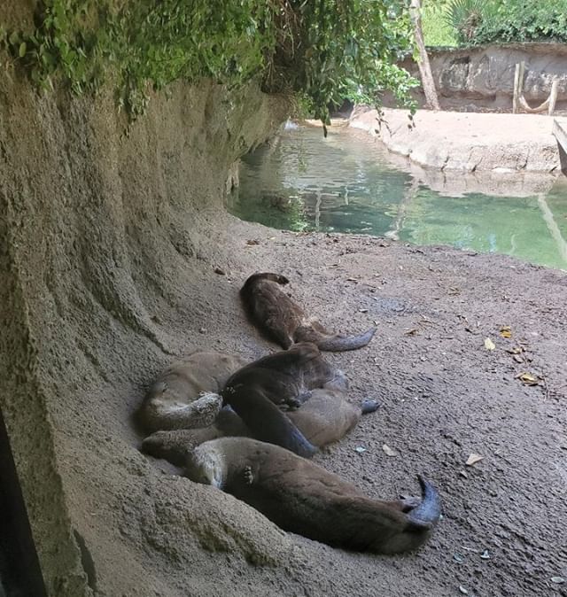
I stumbled upon this YouTube video while researching sea otters on the web for inspiration for a new exhibit.  I'm sure most of you have seen it before, as, according to YouTube, its the most watched animal video of all time.  Killer CuteBut, its an excellent example of the human-animal connection occurring at a zoo (or aquarium, as in this case).  At first glance, you wouldn't think the design of the exhibit would have anything to do with this connection.  Its all about the otters.  Its always about the otters when you're dealing with an otter exhibit...People love otters.  And, I'm just as guilty as the next girl. 

Think about it though.  The exhibit isn't anything special, from what I can see from the video, but, special thought was given to how the guests would view the furry little floating faces.  Sea Otters spend most of their time on exhibit in their pool.  They dive and swim, but mostly, they float around on their backs, pudgy bellies exposed to the sun.  Placing the visitors above the water level looking down into the pool allows the guest to capture this cute moment (that's actually quite common, as it is part of the natural behavior of the otters). 

Remember...cute sells.  And, cute equals connection.  This video proves it 10,000,000+ times!

[youtube=http://www.youtube.com/watch?v=epUk3T2Kfno&hl=en]

Add to FacebookAdd to DiggAdd to Del.icio.usAdd to StumbleuponAdd to RedditAdd to BlinklistAdd to Ma.gnoliaAdd to TechnoratiAdd to FurlAdd to Newsvine


Messages and Meanings...Part 1

Excerpted from my thesis entitled "Historic Zoo Architecture: Creating New Meaning"

Miscommunication, whether between two people or between a facility and its masses of visitors, is a very important issue in zoo design today.  Zoo professionals strive to educate the public on the ideals of conservation.  Using exhibit design and intricate interpretives and signage, zoos attempt to educate while entertaining.  In many cases, zoo professionals and designers overlook the contextual clues we unknowingly pass onto visitors.  Sometimes our biases blind us to details that may affect how visitors receive the conservation message we are trying to pass on. 

To further complicate things, zoos today are oftentimes utilizing exhibits that are old and outdated.  With over 100 zoos in the United States having opened over 50 years ago, a good number of exhibits in use today are outdated (Kisling, Jr., 2001).   These exhibits can carry more obvious contradictory clues to the conservation message, and create a situation in which visitors walk away not understanding the message and even worse, having negative feelings toward the animal or zoo.   Exhibits that are dominated by human forces, such as art and architecture, may oppose conservation and preservation ideals creating an ambiguous meaning for visitors.   Art and architecture are human centered activities that can create the subliminal message "We are more important than wildlife and nature".

Historic Elephant House, in use as of 2003

In this day and age, a great many zoos are considered historic, sustaining historic structures, and limited in space by urban situations.  Zoo designers are facing the challenge of not only increasing the quality and level of communication of zoo messages but also reusing these historic structures in a way that allows clear positive meaning for visitors.  The question now is:  Can this be done?