San Francisco Zoo's Tigers Back on Exhibit

Most of us are aware of the tiger escape and subsequent attack that occurred last Christmas at the San Francisco Zoo.  The attack has spurned much controversy from the public (look at the comments on the YouTube videos below), and also within the zoo community regarding the "guidelines" the AZA puts forth. [youtube=http://www.youtube.com/watch?v=kh6finppjLI&hl=en]

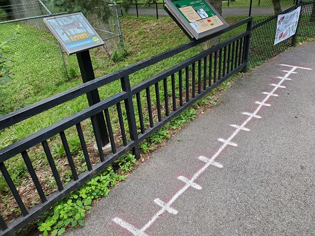
The most recent published guidelines recommended 16' height on moats and with 25' width, and 20' height on walls.   San Francisco's exhibit had 15' height moat.  I'm unsure of the width.  However, they've subsequently gone back and built additional height to the public side of the exhibit. 

The topic demonstrates the fact that we can never be too safe when it comes to both animal safety and human safety (keeper and visitor).  However, at some point, we're overdesigning to the point that the experience of visiting the zoo becomes more prison-like with 20 foot walls everywhere. 

In this case, some evidence has been provided that the victims of the attack could have been taunting the tiger.  These instances are such that any animal could find a way to escape any enclosure.   Should we design for those instances?  Or should we design for day to day safety? 

This is a similar question to how many people should we be designing for?  Peak day, where the park is cram packed, or a more average day.  In this example, we generally design for the average day (aka design day), and accept a certain degree of discomfort on peak days.  Ironically, if we take this same tactic to enclosure safety, the level of discomfort in those extreme situations is much more "uncomfortable" (death isn't exactly a "let it slide" circumstance). 

For now, the AZA is redeveloping its recommendations for tiger barriers.  Bare in mind these are simply recommendations, and zoos have every right not to follow the minimums, making the walls and moats larger or smaller, if they so choose. 

Ultimately, we want to avoid design flaws that make guests able to directly access an animal or an animal to access the guest (unintentionally), while still allowing the guests to see the critters.  As you can see, the guests as San Francisco Zoo still love their tigers.  [youtube=http://www.youtube.com/watch?v=62DzFV_xLjQ&hl=en]

Add to FacebookAdd to DiggAdd to Del.icio.usAdd to StumbleuponAdd to RedditAdd to BlinklistAdd to Ma.gnoliaAdd to TechnoratiAdd to FurlAdd to Newsvine


Natural Enrichment Ideas for Exhibit Design

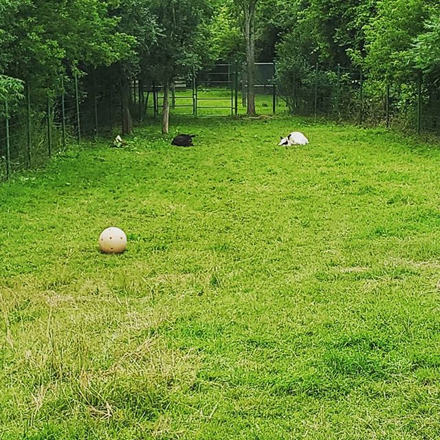
We've all been witness to, and some of us may be to blame for, the red boomer balls in tiger exhibits or the blue barrels in the polar bears habitat.  I've heard guests laugh about beer kegs in the bear exhibits, implying in some manner that the bear's an alcoholic.  Positively enjoyable for the guests and the bear, but still a problem as they bring a wholly artificial element into an otherwise "natural" setting.

polar bear video

Watch Video.

In an effort to curb these disruptions in our suspension of disbelief in an immersive zoo exhibit (in other words, in order for us to get rid of any sign that we are, in fact, in a zoo, and not in Borneo or Alaska), we need to start planning the enrichment as a part of the exhibit design process with the keepers.

Jon Coe wrote a nicely illustrated paper for the Australasian Regional Association of Zoological Parks and Aquaria conference back in 2006.  Within this paper not only does he clearly outline several concepts for enrichment devices within exhibits, but also lays out some general guidelines.  Take a look!

Add to FacebookAdd to DiggAdd to Del.icio.usAdd to StumbleuponAdd to RedditAdd to BlinklistAdd to Ma.gnoliaAdd to TechnoratiAdd to FurlAdd to Newsvine

Learning at Zoos...Do they get it?

Learning is the culmination of perceptions and knowledge.  It is assessed by changes in attitude and behavior (Powell, 1969).  Therefore, creation of meaning is a form of learning.  "Learning...is the means through which we acquire not only skills and knowledge, but values, attitudes, and emotional reactions" (Taylor, 2002).  As educators know, people learn by different means:  visual clues, reading, hands-on experience, imitation, and so on.  Successful learning generally occurs through repetition and utilization of multiple channels of education (Powell, 1969).  In assigning meaning to a zoo exhibit, a person can learn through contextual clues of the exhibit, written signage, hands-on interpretives, and docents. Although several channels of learning are available to a zoo visitor, it is important to remember that successful education depends on the "inclination and ability to receive and to respond" to these education channels (Taylor, 2002).  Understanding that visitors may or may not be visiting the zoo with the intention of learning is a first step to more successfully educating the visitors.  This means that we must not only provide interesting signage and interpretives, but we have the daunting task of ensuring that every aspect of the exhibit follows the educational message we are intending to send. 

Bronx Zoo

Additionally, we have to create an environment where learning is fun.  Usually, people don't come to the zoo to read.  Walking up to an exhibit with a slew text on a sign can be overly intimidating to visitors.  I've done studies on visitor behavior and have found that barely 2% of visitors completely read text panels next to zoo exhibits.  Most glance at the sign to learn the name of the animal or some other easily accessible information, depending on how the sign is laid out, like where its from or what it eats.  Therefore, learning and meaning assessment is generally accoomplished through visual cues and sensorial experience, and not intentional educational signage. 

Text Heavy Sign

Because of this, many designers live by the notion of "Edutainment" (educational entertainment).  Obviously, this style of design requires us to develop an in-depth story for experience alongside the equally important educational "big idea".  The two intertwine and support each other.  Recently, edutainment has meant an engaging, true to life environment, completely immersing the visitor in the natural habitat of the animal along with the region's cultural cues.  However, I question if we cannot spread our wings a bit from the reality of a specific place to encompass more of a fantasy feeling, to entertain, while still meeting our educational goals. 

Ultimately, learning in zoos and aquariums (and museums, as well) must be recongnized as a crucial component in our designs.  Being responsible designers means to be aware of the meaning our guests assign to the experience they just encountered.  Did the rollercoaster through the orangutan exhibit subconsciously lower the value of the orangutan to the visitor, or did it heighten the excitement of the experience thereby increasing the excitement associated with all aspects of the experience, including the animals related?  Did the addition of text heavy graphics throughout the exhibit make the exhibit less fun for the visitor, or make the information less accessible to them?  What about that trench drain at the foot of the underwater viewing area?  How does that affect the viewer's experience? 

Zoo Atlanta

At the heart of the issue is why we are doing what we do.  Connection.  If someone doesnt entirely get all of the educational goals at the end of their experience, but do walk away thinking, Man, those Orangutans are cool!  Then we did our job, in my humble opinion. 

The Polar Bear Controversy

If you google "polar bear" + death + zoo, you'll find a slew of polar bear deaths over the past few years.  Most, if not all, were not due to neglect on the zoo's part, but were accidents or medical issues.  However, because of public and animal activism outcry, zoos have had to take a long, hard look at whether or not they should continue to display polar bears.  Recently, our firm has had the opportunity to work with several zoos on their new polar bear exhibits.  The impetus to create new habitats for these bears has stemmed both from public outcry and also from the recognition of the poor design of the bears' enclosures.  

Bear Pit in BerneHistorically, around the turn of the 20th century, bears of all kinds were held in a "bear pit."  Originally, these pits are exactly as they are named; rock enclosures with a depressed center where people can look down onto the bears.  Slowly, through the 1940s, the pit design evolved into more of an eye-to-eye enclosure, rather than a depression, where the bears' habitat is on similar grade to the visitor.  

Inspired by Carl Hagenbeck, moats were incorporated across the fronts Modern Bear Pit of these "modern pits" and allowed a more unobstructed view to the bears.  Exhibits are small, with little to no natural substrate, and generally include a small, five or six foot deep pool, ensuring the bears will be in view at all points along the open viewing rail.  Access to back-of-house dens directly connect to the back of the exhibit, tucked inside rocks, leaving a nice little den for the bear to sleep in away from the visitor.  

Until recently, these were the standard bear exhibits seen throughout zoos worldwide.  Luckily, whether out of concern for perception of care or well-being of the animals, zoos have started an exhibit design evolution of these exhibits.  

Along with increasing sizes of exhibits, zoos are incorporating underwater viewing, deep pools, shallow pools, natural streams, natural substrate for digging and denning, places to hide, cool rocks, fish shooters and more.  A lot of these recommendations are coming directly from the knowledgeable folks at the AZA Bear TAG.  

Detroit Zoo's Polar BearsPart of the controversy with the new exhibits, however, in terms of design, is the barriers. Until recently, USDA APHIS guidelines were the only standards available for any aspects of the polar bear exhibit design.  Horribly small minimums for dry area and pool surface area and depth were the only standards outlined in these regulations.  Barrier height was left to the zoo's discretion, averaging around 12' in height for walls and width and depth of moats.  

In response to the need for better guidelines, the AZA announced they'd be creating Standardized Guidelines for polar bears, outlining the zoo community's collective opinion on habitat design, including barriers.  At the same time, the province of Manitoba released an official document (which later became law, as I understand it), mandating exhibit minimums for any zoo hoping to receive a "polar bear donation" from the province (which is a major sector of polar bear habitat).  

From the Manitoba Conservation webpageThe policy specifies that only orphaned cubs will be donated to zoos, that cubs will not be captured specifically for donation to zoos, and that animals will only be donated to zoos that meet or exceed the specified standards.  

Procedures further require that the receiving zoo must enter into a contractual obligation to maintain the required facilities for the life of the bear... and to ensure that if the bear or offspring are transferred, the new facility also meets or exceeds the specified standards.  

The facility standards require, among other things, that barriers are 20' tall in the case of walls and depth of moats, and 20' wide for moats. 

The AZA guidelines released soon after did not follow these regulations and are recommending only 16' in height (and width of moats), with 20'distance from visitor viewing to bear area (16' moat plus 4' landscape buffer to handrail). 

The question for zoos now is:  Which do we follow? 

San Diego's Polar BearsMost bears in zoos are born in captivity, but a few still come from Canada as a "donation" due to the orphaned bear problem.  Zoos must now use their magic eight ball to determine if they will, in the future, take Canadian bears to fill their collection needs as older bears die, or if they should invest in better facilities for breeding.  Some zoos are deciding the costs of the extra 4' in barrier height do not fit their capital budget. 

Other zoos are choosing to delete polar bears from their collections completely, knowing the costs of updating exhibits are just too high for the benefit they would gain by keeping the animals.  

Either way, polar bears across the globe are getting new digs.  Hopefully, the public will applaud these changes, instead of taking aim at zoos lagging behind.  Only the magic eight ball can know for sure.

Add to FacebookAdd to DiggAdd to Del.icio.usAdd to StumbleuponAdd to RedditAdd to BlinklistAdd to Ma.gnoliaAdd to TechnoratiAdd to FurlAdd to Newsvine

Video Games Get It...Do We?

That's Me!

My husband is an avid gamer.  Consequently, I am a gamer by marriage.  If I want to spend quality time with my man, I must understand the difference between RPGs (role playing games) and FPSs (first person shooters), be able to identify a side scroller vs. a top down, know what a "cut scene" is, and understand why Grand Theft Auto 4 isn't called Grand Theft Auto 6, despite the fact that it is, in fact, the sixth installment.  I know what he means when he yells into the mini mic perched over his ear, "I got shottie," or why he gets so angry when his game is "laggy."  However, I'm not blessed with the ability to actually play these games (with the exception of Wii's Petz Catz 2 and, surprisingly, I'm wicked with the chainsaw in Gears of War).   So I spend many, many hours watching the games.  And as he plays through the games, beating the bosses and eventually beating the game, I feel as if I was part of the accomplishment.  It's sad, yes, but, oh, so true.  (And, for those of you who didn't understand most of the above paragraph, I apologize.)   

All of these hours of game play watching have made me realize some things about today's video games.  For those uninitiated to gaming, I will expound. 

1.  Video games are compelling.  The very best have storylines more interesting and well-written than many of today's movie blockbusters.  Beyond the main storyline, some require variations of dialogue written for different options chosen as you play along (if you choose to kill someone vs. sparing their life, for instance).  A brilliant example of writing in video games is in the overly controversial Grand Theft Auto 4 in which players can watch a myriad of television channels, each with their own created-for-the-game television programming, or listen to 18 channels of radio with commercials and talk shows written just for the game. 

Metal Gear Solid 4
bioshock

2.  Video games are beautiful.  The craft of video game creation is based in graphic illustration.  Look at any of the concept art of literally ANY game and you'll find gorgeous renderings of characters, places, and costumes that rival any fashion or film illustrations.  Even the games themselves are getting more and more life-like, or fantastical, in their nature, becoming more visually stunning with every new big release.  My husband is in awe of his current challenge, Metal Gear Solid 4, for making him believe for the first time in a game that he was actually watching live action, when he was, in fact, watching an animated cut scene.   My favorite of his games, Bioshock, is so beautifully art directed it makes me sad to think they are possibly turning it into a film.  Film could never recreate the richness, fantasy, and eeriness of the animated game. 

3.  Video games are repeatable.  Even after he's beaten the game, my husband will go back to games to replay levels, change characters, or change the path the character takes.  You can't do that with books or movies as the experience is always the same.

Portal
love my companion cube

4.  Video games require that you learn.  This may be a surprising one to those who believe video games are spawn of Satan.  Whether it's a puzzle game intentionally challenging your mental capacity and wit, or just a regular old first person shooter, you have to learn the nuances of the game play, understand the characters you are playing and plotting against, and learn the setting and story.  If not, you simply cannot play the game. One of my favorite examples of both writing and mental stamina is Portal.  This is a puzzle game requiring you to understand geometry and spatial relationships.  I couldn't even follow my husband past the first initial learning levels as he played through to the final level.  This was an entirely new way to look at space and your ability to manipulate the environment.  Not to mention the game's ability to make a steel cube incredibly cute and lovable. 

I could keep writing on why I believe video games are beneficial, but this is about exhibit design.  So I should get to that.  

Remove the words "video games" from the aforementioned list, and replace it with "exhibits" (be it zoo, aquarium, or museum).  These are the attributes we strive for in every exhibit.  Compelling, beautiful, repeatable, and educational.  Every time.  What is it that video games do that we don't?  

The major difference is that exhibits tend to be passive, despite the interactives and graphics we infuse them.  Visitors follow one path that we've designed specifically to experience in a specific order.  Just like a movie.  We've created an emotional journey that we want the visitor to experience, as we've designed it, step by step.  Sure, we have exhibits that are more free-for-all types that allow you to mingle among the animals, more like an art gallery or art museum.  However, even these have their emotional arcs.  

choose your own

Remember the old "Choose Your Own Adventure" books from the eighties?  That's what modern video games are to this generation.  You start out on a set path, and along the way you can choose several options, whether it's actually affecting the storyline or it's a matter of making your character look as you'd prefer, it's your choice.  You're in control.   Or so it seems.  

What if we started doing this with exhibits?  Could we plausibly allow visitors to choose their own path, whereby they might or might not see the same animals as someone choosing differently.  Could we develop an educational storyline to support our mission within this context?  Absolutely.  In fact, the story might end up being much more dramatic and effective if the visitor was to take an active role in choosing their own fate.  For example, pose the question to the visitor as they enter...Are you a conservationist or a poacher?  Two separate paths.  Along these paths, the visitor will be faced with more questions and more "doors" to choose from.  Eventually, paths will collide and merge, but along the way, choices cause visible effects.  This way, visitors would be encouraged to repeat the exhibit to see how other choices would affect their outcome.  

Now, pair this with visually stunning settings, designed down to the atmospheric lighting and smells, and well-written graphics, and you've got people's attention.  If they are caught up in the environment, caught up in the story, they're learning.  Whether they like it or not.  

bioshock

Designers will argue they already deliver beautiful environments.  I have to say, go rent Bioshock and muddle your way through, and tell me one aquarium that's even half as beautiful and engaging. Then we'll talk. 

Drawing...By Hand or Computer?

I hear it around the office all the time...I wish I could draw like so and so. That so and so is one of the, eh-hem, old-school architects, from the days when being an architect meant being an artist as well. I think back to design school and our one, frankly, wimpy drawing School drawingclass...entitled "Graphics for Landscape Architecture" or some such art-opposing title. We spent hours sitting outside, trying pitifully to draw natural trees and shrubs in a lifelike manner. Then, weeks were spent summarizing the real trees and shrubs into miniature symbols for use on plans and sections. Creativity was encouraged, but drawings skills were not incubated; and in my case, drawing skills were left unborn.

Perhaps in an argument to convince us that all of this was alright, we were told repeatedly, you'll never draw in the real world anyway. Just learn Photoshop and AutoCad, because that's all you'll ever use. So hours and hours and hours, and months and months and months, project after project were produced using Photoshop, and in advanced cases, AutoCad. I drew quite pathetically, but I drew, and incorporated those drawings into larger Photoshop creations. I may not have been complimented on my drawing skills, but I was ALWAYS complimented on my graphic design skills.

Fast forward to today... the last few weeks have been spent bent over the drawing board. Literally. A real, live drawing board. Even has a Mayline (or generic equivalent parallel rule). In school, I searched for a Mayline for my drafting table, and was told repeatedly by art suppliers and office suppliers that no one's making these anymore. Everyone uses AutoCad.

Kansas City Zoo Otter Concept PlanThis is typical for me. My company doesn't really have titles and specific roles, like "You're a designer, and you're a drafter." Everyone sort of does everything, but I tend to be more of a concept designer. I've never designed on AutoCad. The only time I even touch AutoCad is when I'm producing construction documents, or to print a base file to draw on.

What's more interesting is most of our drawings we send out for concepts and masterplans are hand drawn. Color is added through Photoshop, sometimes with markers. I've had more drawings placed in front of clients drawn by hand than by AutoCad. Luckily, I've learned to draw. On the job training, I guess.

All that unofficial training in graphic design has gone untouched in the real world. I've never done a graphic layout for a presentation here. Maybe our office is different, but I suspect not. We have actual graphic designers to do any layouts.

But, I am drawing. By hand. With pencils and pens. I'm no Old School Architect, but that doesn't matter.

Concept for Bird ExhibitThe moral of the story...design will never leave paper and pens behind. There is something immersive about the tactile process of pulling out the tracing paper and drawing and tracing and scratching out mistakes. There's nothing better than the surprisingingly, loud, and distracting crackle of a crumpling trace paper ball (although, now I carefully fold my scraps into tight little rectangles to fit into my recycle bin).

If someone tries to tell you that you don't need to know how to draw as a designer, just nod and smile, and go back to your sketch book.

Add to FacebookAdd to DiggAdd to Del.icio.usAdd to StumbleuponAdd to RedditAdd to BlinklistAdd to Ma.gnoliaAdd to TechnoratiAdd to FurlAdd to Newsvine

Messages and Meanings...Part 2

Message and meaning are two terms that are generally used interchangeably, but have distinct implications in relation to exhibitry.  The message is the verbal communication received by the visitor. This is the intended communication from the zoo; what is written on the signs and the underlying communication used to help define the design.  The meaning is then determined by the contextual clues given by the environment plus the message (Robinson, 1995).  The meaning is what the visitor interprets from the exhibit, and therefore is what ultimately affects their attitude and educational experience. 

Message = Educational Big Idea.  Meaning = Visitor Interpretation.

historic zoo settingContext can easily be in contradiction to the message, which can cause visitors to walk away with an unclear meaning.  Such is the case in historic zoo exhibits where, for example, steel bars on concrete boxes stand between the visitor and the animal, while at the same time, graphics discuss the importance of this animal in a healthy ecosystem.  Before the Philadelphia Zoo underwent a much needed renovation of its Cat House, the historic exhibit was an excellent example of this confusion.

Ambiguity of meaning will undermine the effectiveness of an exhibit.  Therefore, a successful exhibit would convey both a positive conservation message and an unambiguous meaning of respect.

Philly cat house pre-renoThis does not, however, define a successful exhibit as a landscape immersion exhibit.  Architecture can easily be incorporated into an exhibit, or even be the dominant feature of the exhibit.  However, this is a subject for a later discussion.  The creation of a compelling storyline along with the educational message, backed by all aspects of design following through on the story, would make a successful and clear message and take away meaning for guests.   

Next, we'll discuss how learning affects meaning.

Add to FacebookAdd to DiggAdd to Del.icio.usAdd to StumbleuponAdd to RedditAdd to BlinklistAdd to Ma.gnoliaAdd to TechnoratiAdd to FurlAdd to Newsvine

Preview of Bronx's Madagascar!

LemursBronx Zoo tackles another great project in this adaptive reuse of the historic Lion House.  The issue of reuse in zoos is near and dear to my heart (see Messages and Meanings Part 1) as I believe some of the most beautiful aspects of zoos are their historic buildings (aside from the critters themselves!).  Oftentimes, a critical mistake occurs with the juxtaposition (yes, I did just write that) of natural exhibit design with the human-dominant structures.  Generally, the best use of these buildings is, in my opinion, a change of use; meaning, a cat house becomes the new restaurant.  In this case, the Bronx decided to change the style of exhibit and species held within, but keep to the original use of 'animal home'.  I'm hoping that this project is another example of successful reuse, and can't wait to see the finished product!  Maybe I'll be able to get the scoop on the design process and decision-making, and post for all to see.  Keep an eye out...

Check out pre-opening pics of Madagascar.

Good luck to all involved during the homestretch!

Connection! Otters as a secret weapon...

I stumbled upon this YouTube video while researching sea otters on the web for inspiration for a new exhibit.  I'm sure most of you have seen it before, as, according to YouTube, its the most watched animal video of all time.  Killer CuteBut, its an excellent example of the human-animal connection occurring at a zoo (or aquarium, as in this case).  At first glance, you wouldn't think the design of the exhibit would have anything to do with this connection.  Its all about the otters.  Its always about the otters when you're dealing with an otter exhibit...People love otters.  And, I'm just as guilty as the next girl. 

Think about it though.  The exhibit isn't anything special, from what I can see from the video, but, special thought was given to how the guests would view the furry little floating faces.  Sea Otters spend most of their time on exhibit in their pool.  They dive and swim, but mostly, they float around on their backs, pudgy bellies exposed to the sun.  Placing the visitors above the water level looking down into the pool allows the guest to capture this cute moment (that's actually quite common, as it is part of the natural behavior of the otters). 

Remember...cute sells.  And, cute equals connection.  This video proves it 10,000,000+ times!

[youtube=http://www.youtube.com/watch?v=epUk3T2Kfno&hl=en]

Add to FacebookAdd to DiggAdd to Del.icio.usAdd to StumbleuponAdd to RedditAdd to BlinklistAdd to Ma.gnoliaAdd to TechnoratiAdd to FurlAdd to Newsvine


Enrichment as Basis of Design?

For those of you new to zoo design, enrichment (or behavioral enrichment or environmental enrichment) is a means for zoos to invigorate the lives of the captive animals by providing activities or environmental changes that encourage the natural instincts and behaviors of the animals.  As designers, we need to recognize the need for enrichment in the daily lives of animals for several reasons:  active animals make exhibits more engaging; active animals equal happy animals in the eyes of our guests.  Sunbear with Halloween Enrichment

Moreover, as designers, we need to make the lives of keepers as easy as possible.  A cramped or impossible to work in space, makes their daily routines more difficult which means less time to work with the animals and provide for their mental stimulation needs. 

So, providing spaces that recognize the need for enrichment is one step...make spaces flexible and workable for the keepers.  Make lots of storage for things like buckets, boomer balls and other toys, cardboard, and anything else a keeper might want to incorporate into the animal's life.  I've found talking to keepers about their routines and enrichment / training activities both encourages exchange of ideas and information (that, frankly, most of us designers are quite ignorant of), and also works to break the barrier of mistrust between the two groups (which is another topic entirely). 

By NevaBut what about creating an entire exhibit based not on story, or visitor experience, or site constraints, but on animal enrichment?  I've only heard of one exhibit that did this...the lemurs at San Francisco Zoo.  (If there are others out there, please let me know.)  I've never actually seen this exhibit, but heard a presentation about a couple of years ago at the AZA National Conference.  Not only did they build the exhibit based solely on the animals' needs and need for enrichment, but they worked in the visitors' need for connection by allowing the visitors to control some of the enrichment activities.  I'm curious to see if this worked. 

Another possible example, which I am unsure if was based primarily on the idea of enrichment, or if the idea came afterward, is the Islands exhibit at Louisville Zoo.  This exhibit links several smaller exhibits so that the animals, both predator and prey, can be rotated between the exhibits as often as possible.  This allows the critters to get residual scents of each other, theoretically enriching their lives.  I know in certain instances this leads to more stress than good, but I also know this exhibit is still functioning in this manner. 

Can we design a fully successful exhibit, from the visitor's point of view, from the animal's point of view, from the keeper's point of view, starting from the enrichment goals?  I think yes.  We can always find a way to wrap the visitors into a story.  And, well, unfortunately, but accurately, the keepers' behind the scenes spaces can always be worked out after the rest of the front of house stuff is designed.  I'd like to see everyone on a design team on board for this sort of thinking and see where it leads us. 

In the meantime, encouraging zoo clients to, at the very least, include a statement of enrichment design and hopefully an enrichment goal outline in every master plan is a place to start.  Even if the concept phase of the exhibit design doesn't focus on enrichment, make sure that at some point in this phase, its brought up.  At the very least, ask what possible enrichment activities could be done with the species in question, and think about how the keepers can incorporate those activities even in the simplest manner throughout.  Make their lives easier, if you can, by providing attachments for toys, easy methods for hiding snacks and scents, and giving them access to the highest points in the exhibits. 

If you get lucky, you'll get a client that wants to really explore how to connect design and enrichment.  For the most part now, though, keepers will continue to fight their way through the daily challenge of enriching their animals' lives without the support of an exhibit truly designed for maximum enrichment opportunities.

And if you'd like to really impress your keepers, check out some of the enrichment websites listed in the Blogroll and come prepared to meetings with ideas!

Add to FacebookAdd to DiggAdd to Del.icio.usAdd to StumbleuponAdd to RedditAdd to BlinklistAdd to Ma.gnoliaAdd to TechnoratiAdd to FurlAdd to Newsvine

Opening: Russia's Grizzly Coast

bearlogoCongratulations to Minnesota Zoo and Portico Group on the opening of their newest exhibit, Russia's Grizzly Coast.  Opened on June 7 to the public, the exhibit looks amazing, incorporating geysers, steam vents, mud pots, and lava tubes to recreate the desolate Russia habitat.  Not many zoos have tackled Russia, due to political sensitivities, but I'm glad to see someone has broken through the invisible wall. 

Stats on the exhibit:

Total Exhibit Size: 3.5 acres

Otter Exhibit: 1,368 sq. ft.

Pool: 34,000 gallons

Bear Exhibit: 13,603 sq. ft.

Stream: 1,800 gallons

Pool: 16,500 gallons

Trout Pond: 2,600 gallons

Boar Exhibit: 1,932 sq. ft.

Leopard Exhibit: 2,785 sq. ft.

Cost: $23.6 million

Add to FacebookAdd to DiggAdd to Del.icio.usAdd to StumbleuponAdd to RedditAdd to BlinklistAdd to Ma.gnoliaAdd to TechnoratiAdd to FurlAdd to Newsvine

Messages and Meanings...Part 1

Excerpted from my thesis entitled "Historic Zoo Architecture: Creating New Meaning"

Miscommunication, whether between two people or between a facility and its masses of visitors, is a very important issue in zoo design today.  Zoo professionals strive to educate the public on the ideals of conservation.  Using exhibit design and intricate interpretives and signage, zoos attempt to educate while entertaining.  In many cases, zoo professionals and designers overlook the contextual clues we unknowingly pass onto visitors.  Sometimes our biases blind us to details that may affect how visitors receive the conservation message we are trying to pass on. 

To further complicate things, zoos today are oftentimes utilizing exhibits that are old and outdated.  With over 100 zoos in the United States having opened over 50 years ago, a good number of exhibits in use today are outdated (Kisling, Jr., 2001).   These exhibits can carry more obvious contradictory clues to the conservation message, and create a situation in which visitors walk away not understanding the message and even worse, having negative feelings toward the animal or zoo.   Exhibits that are dominated by human forces, such as art and architecture, may oppose conservation and preservation ideals creating an ambiguous meaning for visitors.   Art and architecture are human centered activities that can create the subliminal message "We are more important than wildlife and nature".

Historic Elephant House, in use as of 2003

In this day and age, a great many zoos are considered historic, sustaining historic structures, and limited in space by urban situations.  Zoo designers are facing the challenge of not only increasing the quality and level of communication of zoo messages but also reusing these historic structures in a way that allows clear positive meaning for visitors.  The question now is:  Can this be done?

Connection through Design

I hear it over and over again.  The same conversation that inevitably goes something like this…Zoology and landscape architecture?   Well, those don’t have anything to do with each other!  What do you do?  I respond, Zoo design.  Their face bares an expression of shock and dismay, ultimately giving way to a smile.  I await this continuation…Well, there must not be much of a calling for that profession, eh!  Uncomfortable laughter.  I smile politely and respond, Actually, if you think about it, most zoos (not to mention aquariums and theme parks) are regularly undergoing some sort of construction, and when they aren’t, they usually are planning for something new.  Someone’s gotta do all that work, especially when you consider there are more than 100 accredited zoos across the U.S. alone.  Add in the non-accredited, the aquaria and the theme parks, plus think about the rest of the world!  There’s plenty of work to do.  Not enough folks to do it, actually.


And that leads me here.  I’m hoping to educate and learn.  I hope to reach those people that never thought there were such people as us.  I hope to reach students that have an idea that they want to do this, but have no idea how to get there (just like me when I started school).  I hope to reach people that need resources, but can’t find them.  I hope to reach those that have resources to share.  I hope to reach parents and children (that’s everyone, folks) who are just curious about the profession, because curiosity in our work means you’ve been touched by our work at some time.  And if we’ve been successful in connecting with you, we’ve been successful.  That’s what it’s all about. 


 “Connection” is a term we use a lot in the industry.  Connecting people to wildlife.  Connecting man to nature.  Connecting the one child’s smile to the one silly, furry otter face.  Connection is happiness.  Connection is curiosity.  Connection is inspiration. 


Discovery Cove, Orlando, FLWe often say connections create action.  In reality, we know that’s not exactly true. How many of us can say that after visiting the zoo and watching the grizzly bear play in the artificial fresh water stream, heart swelling with delight and the good ole’ warm fuzzies…How many of us can say we went home and started calling others in an effort to collect money to contribute to saving the grizzly habitat?  Or, stopped using so much water?  Or, even just recycled that water bottle you were carrying the entire trip to the zoo?  Not many of us.  Zoo designers’ work is important; don’t get me wrong.  But, what we do is much subtler than we sometimes forget.  Connections fill people with wonder, and, if for one second, they feel empathy for that critter they’re connecting with, we’ve succeeded.  Empathy is what builds caring.  Empathy is what builds action in the future.  Empathy is what makes the busy young professional volunteer time at a wildlife rehabilitation center.  Empathy is what makes a research scientist out of a video game addicted kid.


So, how can you get into Zoo Design?  A great question.  Mostly, it takes passion.  I don’t know everything about the profession.  In fact, I’m a fairly new comer to the game in comparison to some of the big dogs.  But, I’ve been in a love/hate relationship with zoos all of my life, and I dug in as an adult.  I started learning to really critique exhibits from the animal side of things, from the keeper sides of things, and, of course, from the visitor side of things.  I started looking and learning.  I started asking questions, and I haven’t stopped.  I keep looking, and keep learning.  Hopefully, with this project, I can teach a little and learn a lot.  Hopefully, I will become a better zoo designer.  Hopefully, I can create connections.    

Add to FacebookAdd to DiggAdd to Del.icio.usAdd to StumbleuponAdd to RedditAdd to BlinklistAdd to Ma.gnoliaAdd to TechnoratiAdd to FurlAdd to Newsvine